|
I)
The over-all design.
I wanted a simple design that was easy to navigate
so I designed it with simple left hand navigation,
under a picture. I chose the five sections because
I feel most of my information fits into one of
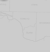
them. The background image is a map of Washington
state, where Kennewick was found lies underneath
this text-box.
II)
Colors
I wanted to keep the colors subtle and use colors
that would be in the spirit of Kennewick. The
background colors were taken from a landscape
photo of an area of Kennewick WA. The background
color for the title is taken from the picture
on the left.
III)
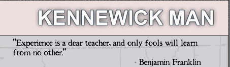
Fonts
For the title I chose a clean sans-serif. I wanted
the title to convey Kennewick with poise and dignity.
For the other fonts, since this is an archaeologic
find, I chose a Times serif font that has been
degraded to give it a old weathered look.
IV)
Shiny Happy Kennewick
Place the mouse over the ":)" in the
lower right of the picture to see how happy Kennewick
is to be part of this website.
-All
design, writing, research, etc. by Dustin Norlander
|