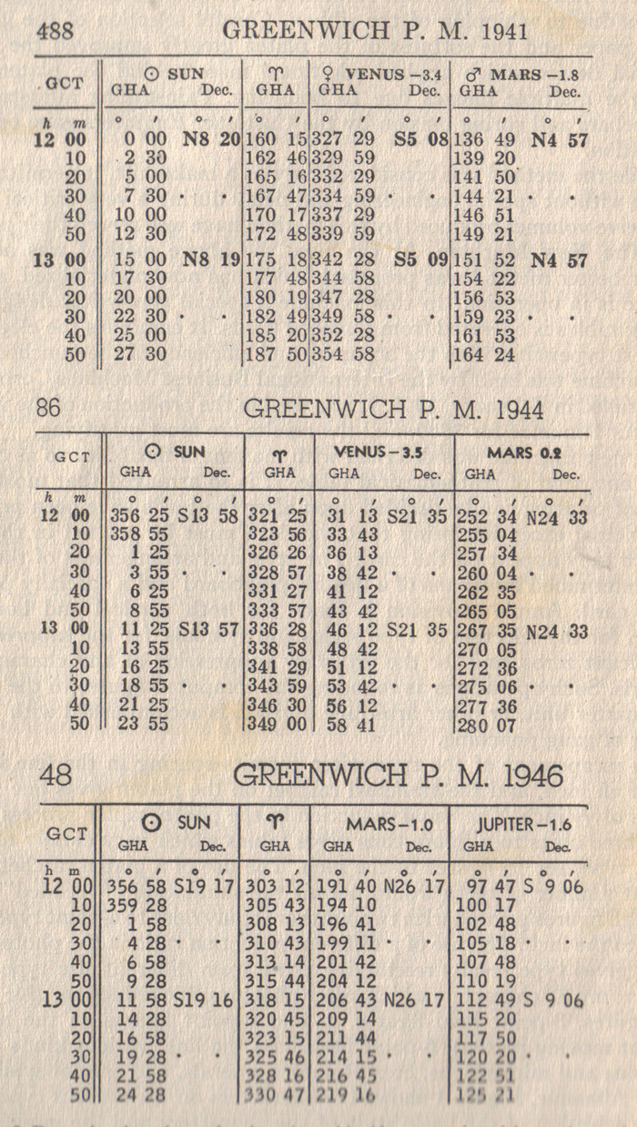
American Air Almanac Page Comparison
[ 1941 ] [ 1942 ] [ 1948 ] [ Almanacs ] [ Naval Observatory ]

The bottom example is from the Card-Operated Table Printer, for which the sans-serif Bell Gothic font was chosen (originally developed by Mergenthaler Linotype for printing telephone directories); notice the thin spacing between some of the columns and the perfect vertical and horizontal alignment. Thanks to Herb Grosch for this scan.